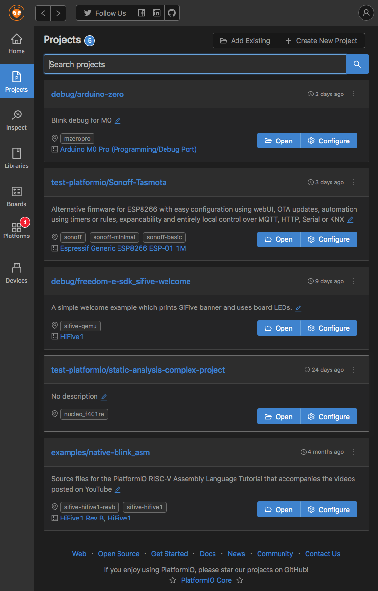
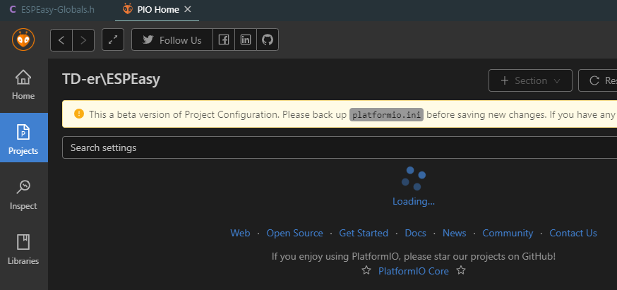
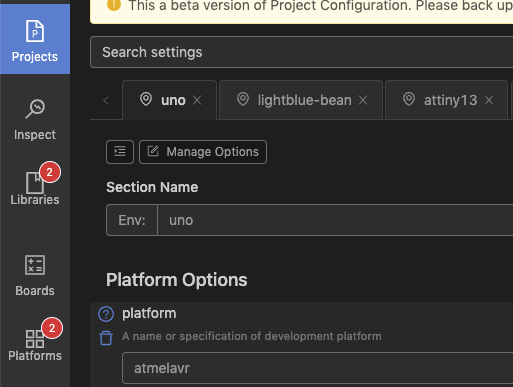
We are glad to announce the first beta version of PlatformIO Home 3.1, where several new features and improvements will be released including a completely new Project Manager and Configuration Tool for “platformio.ini”!
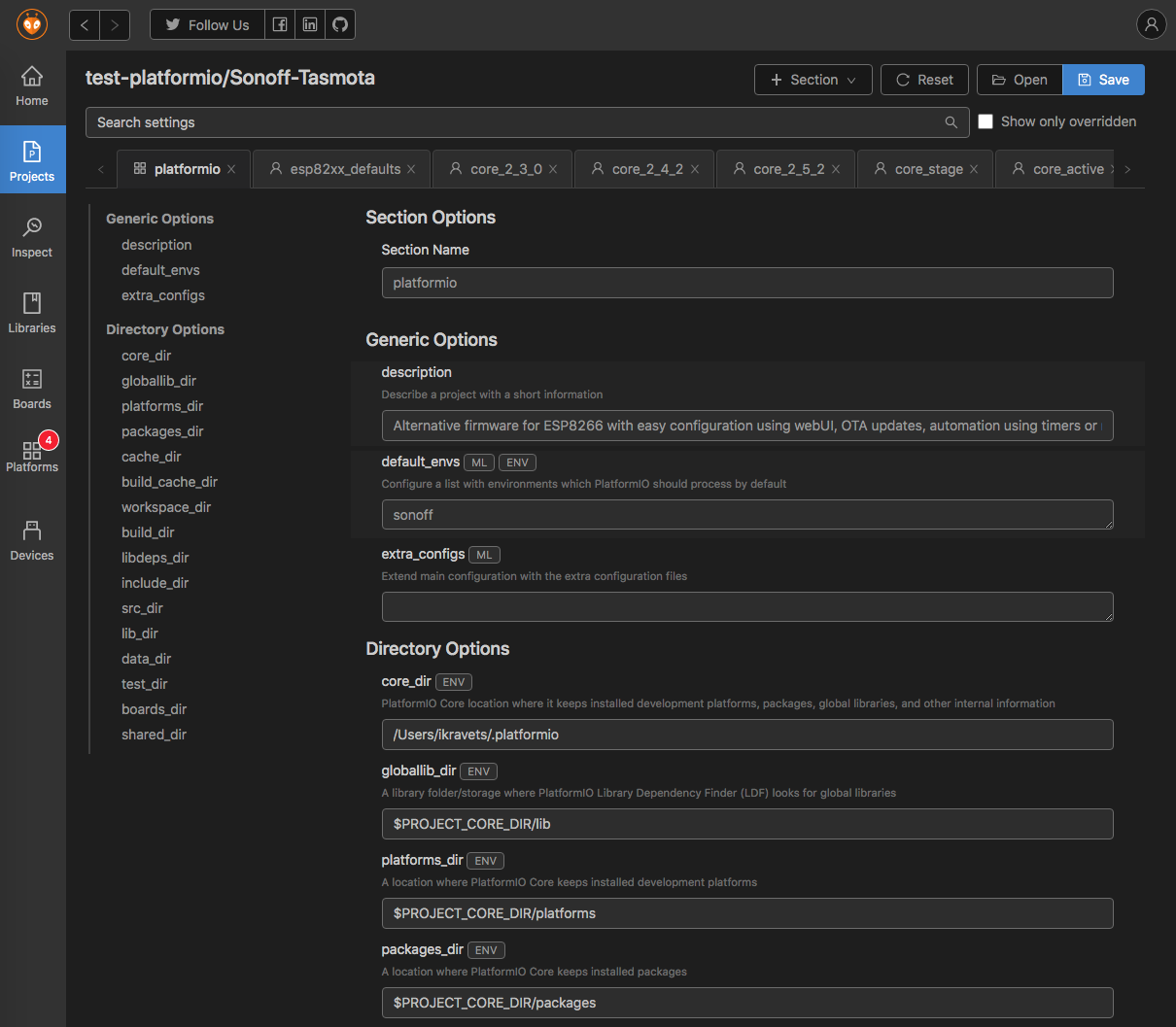
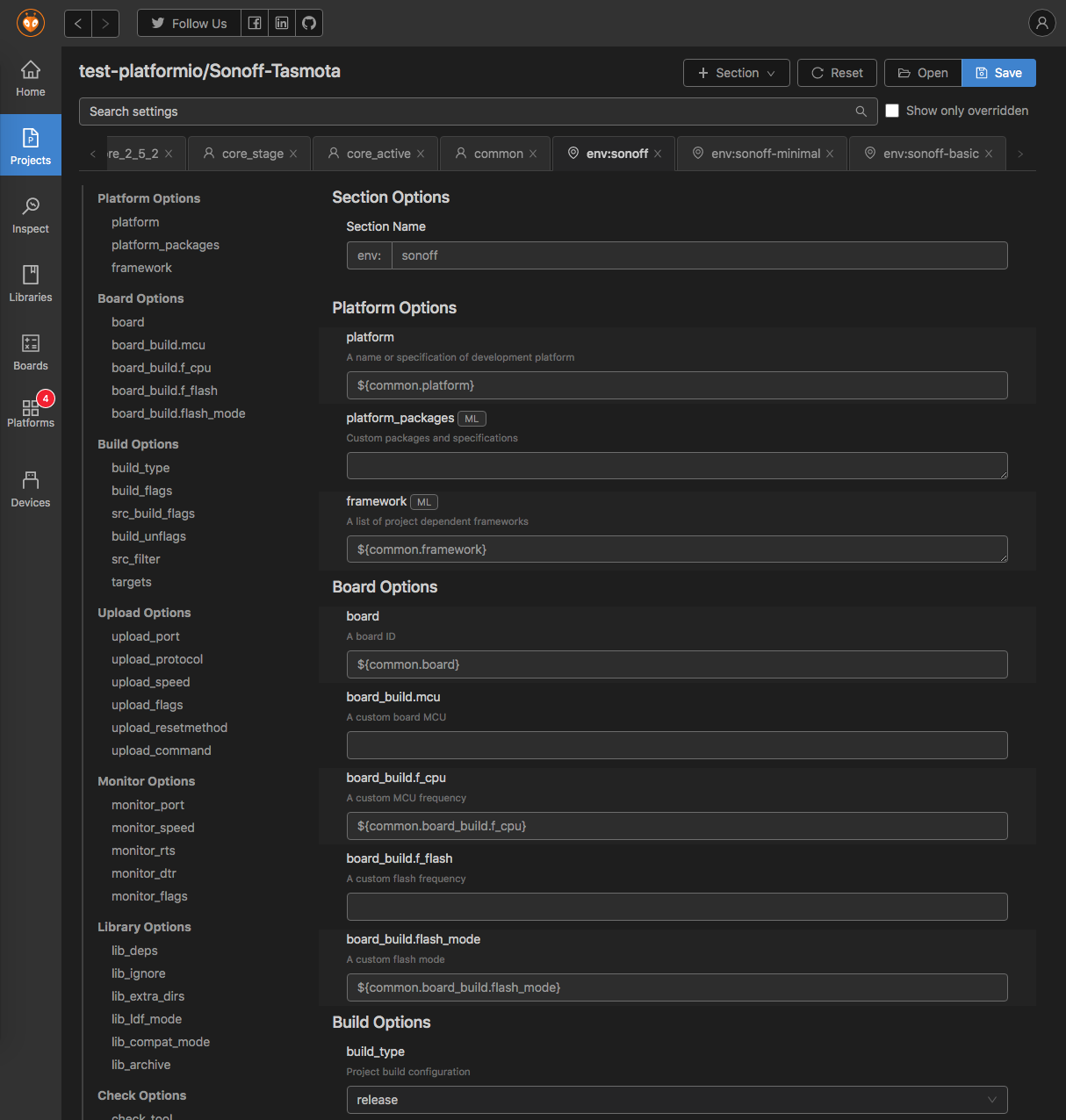
Project Configuration has been the most requested feature for the last years. A lot of new configuration options were added to “platformio.ini” and it is very difficult to remember all of them. Very often developers even do not know that they can tune default configuration for “build”, “upload”, “debug”, “monitor” and other operations. The new UI for “platformio.ini” provides amazing functionality. Each configuration option is documented and has a direct link to documentation where you can find more details and check examples.
The PlatformIO Home 3.1 will come together with the final release of PlatformIO Core 4.1.1. If you would like to try the latest stable development version of PlatformIO Core, please do the next:
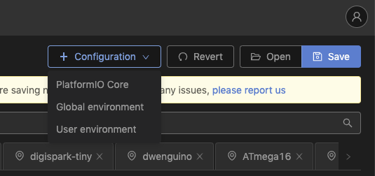
PlatformIO IDE for VSCode: Open VSCode Settings and enable “Use development version of PlatformIO Core (CLI)”. Restart VSCode
PlatformIO Core or PlatformIO IDE Terminal: Run pio upgrade --dev command in terminal. Start pio home which will open GUI in your system browser.
I’m amazed at the speed PlatformIO evolves. And indeed assistance regarding configuration options would have saved me some time in the past.
So I eagerly updated to the development version. But I’m sorry to say I don’t think I will use it in the future. It just isn’t that helpful…
There are too many input fields with no distinction between the import and unimportant ones, between the frequently and the rarely used. The sheer size of the page is overwhelming.
Except for a few combo boxes, there are mainly empty text fields with no assistance. So one usually needs to go to the documentation of the option or the board anyway. Wouldn’t it be possible to at least show the possible values for things like the upload protocols and debug tools available for the selected board?
One of the most frequently used fields is lib_deps. It would really profit from assistance. Instead, there’s the separate library manager, which prefers to install libraries globally. (I think that’s the second biggest shortcoming of the current PlatformIO.) How cool would it be if the library manager was well integrated and would just modify lib_deps.
Empty fields are confusing. They could mean that the option has no value, or that the default value is used, or that the value from an inherited environment is used. On the other hand, some fields have a value even though they are not specified in platformio.ini. Aside from combo boxes src_filter and check_tool are such examples. This confusion also applies in the other direction: It’s unclear what to enter to set an option to empty, what to enter to have it use the default value, and what to enter to inherit the value from another environment. It affects both text fields and combo boxes.
And then there are these smaller things that you can hopefully iron out before the final release:
The entries lib_archive = yes and test_build_project_src are always inserted, for no obvious reason.
All comments in platformio.ini are lost; instead the standard header is inserted.
The UI doesn’t not synchronize with the platformio.ini file if it is edited at the same time. One needs to navigate back to the Projects page and then select the project again.
If a project was opened via VSC’s file menu, it does not appear on the Projects page even if the project is currently open in VSC.
Sorry for the rather negative feedback. But I’m afraid it’s not that helpful yet - neither for beginners nor for advanced users.
– Manuel
I haven’t used it yet, but just from the screenshot I have to agree it looks… overwhelming. Nice to actually have some form of UI for the platformio.ini at all…
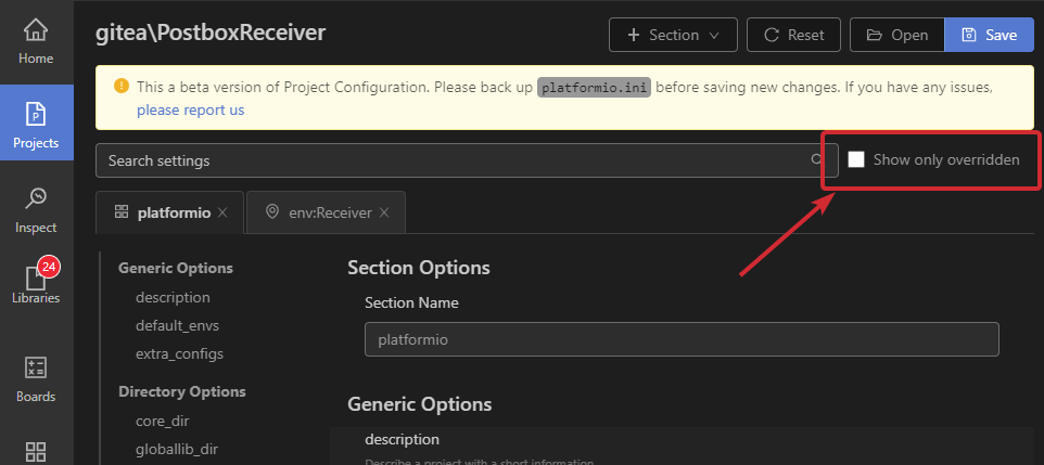
re: the overwhelming list… perhaps that’s what the ‘show only overridden’ checkbox at the end of the search field is for? Only to show what’s been set? i.e. So you can change configured values only?
Either way, installing now to give it a try
Edit: Yup, the ‘Show only overridden’ option culls that list down to just the stuff that’s been configured. Much more manageable, but perhaps worth considering making it more visible - as one would think at present it’s related to the search field…
I didn’t notice the
The entries lib_archive = yes and test_build_project_src are always inserted,
that Manuel mentioned but I did noticed the lib_archive checkbox ticked, and test_build_project_src was unticked (i.e.) at defaults.
Edit2: I take that back… I saved my platformio.ini again just then, and these values turned up.
It was annoying that I lost comments in my platformio.ini though, as my notes as to library ids were lost. Plus the full header re-added… although that’s a minor detail.
Should the Reset button be perhaps named Refresh or Revert? As it seems it does re-sync the GUI to the current platformio.inistate? Is it possible to add some form of file watcher so it can prompt to do that if the file is changed (and changes saved) whilst the configurator is open?
I’ll repeat some of this as a couple of PRs on PIO Home so they can considered and task-listed if suitable.
I tested it on VS code on my ChromeBook, but right now, I cannot edit any field in the project configurator.
I will test it later on Windows, but it seems a bit like the same bug in VS code in Windows where you have to double-click the tab to get the focus on input fields.
Right now, double click in the (Debian) version of VS code on the Chromebook doesn’t work either.
Another thing I’m missing, is that it only shows the options included in the configuration.
So if I want to include the options I didn’t know, I have to switch to a new config to have them and copy the values. So it would be nice to “upgrade” an environment to “full” and after editing to optimize it by hiding unused options.
Also it would be really nice to have 2 environments next to eachother so you can compare them.
Edit:
It can be edited after clicking a lot on the tab.
But saving is not possible?
Ability to “scroll” over the tabs using the scroll wheel.
It is rather annoying to click multiple times at the small arrow next to the tab to go to the right tab.
Show “derived values” for all.
When using the extends option, it may not be clear what values are taken from where, so it would be nice to see where variables are actually defined and what values they have.
Re-arrange env definitions by re-arranging tab order.
Draw a tree of what env uses what value from where (using extends)
Order variables in an env in the same way they are also presented when “Show only overridden” is unchecked.
Make path parameters platform independent. For example, I have no clue how to define build_cache_dir to be usable for both Linux and Windows. (not really a feature request for this, but more a generic one I guess)
Edit:
Another feature request:
It would be great to have something like a += way of extends.
For example setting the build_flags, you often want to just set extra flags for “custom” defines etc. but the flash layout is also part of the build_flags.
So for defining a setup with different flash size, you still have to use the old way of concatenating flags.
Hi Manuel! This is one of the best feedback which we received ever. We need more feedbacks like these. They motivate us and help to make the best product in the market.
I’ll not comment on your blocks. We totally agree with all of them. The big problem is here => " The sheer size of the page is overwhelming.".
This is not a final release, just the first beta. We call it inside 1-st MVP. We did it with minimal efforts just to get your feedback and help us to continue further development.
I want to introduce our engineer who works on this front-end → @eugene.liulka. So, please help him.
@eugene.liulka, please share here our further steps and what we plan to do next. Thanks!
Thank you, Ivan for introducing myself.
I’m working on the frontend for Project configuration and I would like to share screenshot of our next move so we can discuss if we are moving into the right way to better accomodate your needs.
Our proposal:
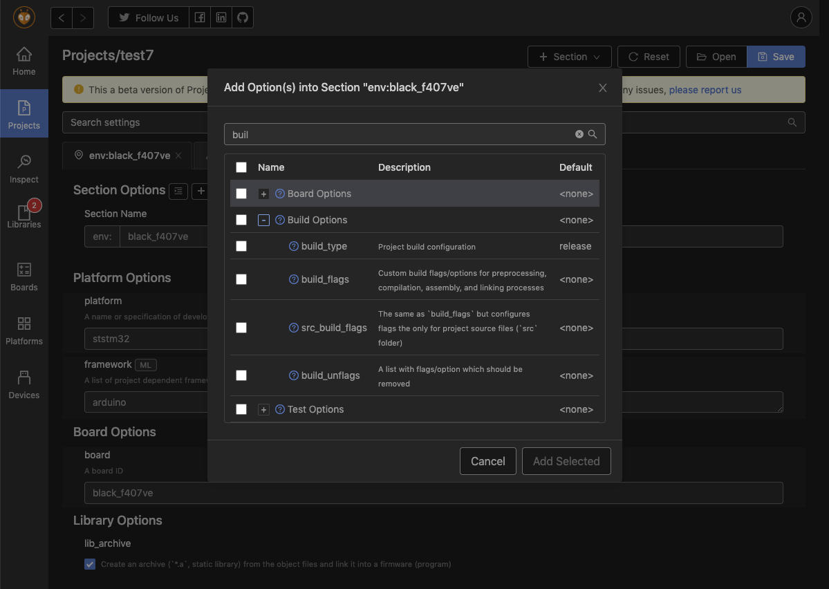
We remove this long page with list of options + values
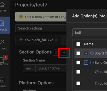
We add a simple button “Add option” near “Section Options” title, under each tab
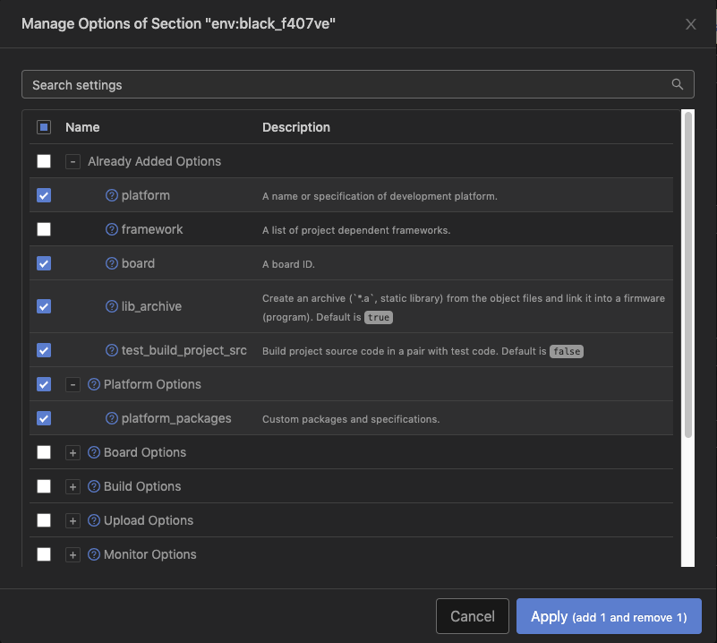
After click users will see modal window with options list/library where he can search/filter and select which options to add
After new options added, users will see them in the same UI as they see now ALL options.
Only ADDED options will go into real platformio.ini. Each option ROW will have “Delete” icon.
Makes it so the main screen shows only (and all of) the configured settings, and you can add any at will via the add button. I think it also solves a lot of the problems around showing the defaults, and tracking states of settings nicely.
Yep that does look a lot more clean.
And since I now have come to really (really!) appreciate the expands option, it would be nice to have the option to add an extra column to that view showing the already present value (next to the “default” column)
So then you not only have a clean view of what to add, but also what it will override (if applicable).
Also it would be a nice extra to visualize the dependencies in a chart.
Since you can have multiple extends, you cannot use a tree view, which the “Explore” option is in the inspect window, but it can be something with multiple parents.
A bit like the inheritance view from Doxygen, but I guess a horizontal view will make more sense here.
I’m not sure that we will implement this. The goal of this configurator is to provide UI for plain platformio.ini. Extending, interpolation will make a lot of problems.
The proposed approach (just showing the configured options plus a dialog to add additional options) seems to be a good approach to address one of the main problems.
The screenshot doesn’t show the Add option button. I think it will be crucial what this button looks like and where it is positioned. Is near Section Options a good place? Or shouldn’t the word Section Options be changed anyway? A section has a name but it doesn’t have an options and it is different from platform, build, upload options etc. So it should be treated and labelled differently to set it apart.
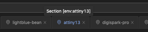
You might also want to look into the “+ Section” button and the tabs. It’s not obvious that tabs represent sections. The UI doesn’t convey that.
Or maybe even rename “Section”. The term makes sense if you think about the .ini file. But for beginners that only use the visual project configuration, it makes no sense at all.
Good points there on the usage of ‘Section’ as the keyword… so perhaps Environment, in keeping with that the different blocks seem to be referred to as that?
And I think the add option button was here in that screenshot: