Found a bug.
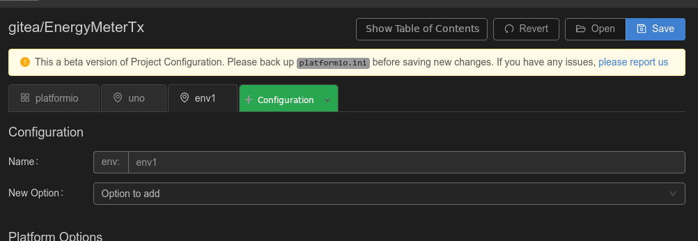
The projects viewer does not show environments which are located in extra_configs
The other ini files cannot be opened in this viewer/editor, only the platformio.ini file can be opened.
1 Like
I don’t like the Manage Options dialog yet. The main business should be in the configuration editor and not in the dialog. Why not go with a simple dialog that will only let you insert a single option? It will be rare to insert several options at once. And Remove should be next to each option and not in the dialog.
Manage Options would then be Insert Option or Add Option. I’m also thinking whether it’s in the correct place. It manages the variable part of the configuration and the variable part starts below the section name.
You could even try to put several Add Options buttons, one next to each xxx Options title or at the end of each group. This seems like a more natural place to look for when adding options. It certainly would take me quite some time to figure out that the Manage Options button at the very top but only in second position is supposed to do it.
Of course, it raises the question if the dialog should show options from a single group only. That would be one way. Another way is to offer all options, but somehow restrict them initially to a single group, either by using a filter or tabs.
What’s the purpose of the paragraph button at the very top (and in first position)?
Now that section has mostly been renamed configuration, Section Name should follow as well.
+ Configuration is complex drop-down. I don’t sufficiently understand which of the choices I would have to select. So I guess it’s a too complex choice for the majority of users as well. A better wording and an obvious default choice is probably needed.
What is the blue question mark in a circle for? Is a placeholder until a better icon has been found? Or is an icon providing help? If the latter is the case, move it after the label.
And what’s the purpose of the trash icon? If it is to delete an option, it should also be moved after the label.
Here is how a select/search field to quickly add an option without modal dialog can look like:
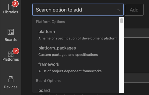
I’m liking that idea more than a modal dialog box… keeps the focus on the configuration page, not on a separate box that pops up. I wonder though if it’s practical / not visually cluttering to put one next to each option block, and restrict the search list to that block, thereby making each list shorter and more contextual.
I like it. Looks simple, intuitive and effective.
Thanks! What is the best place for this option? Should it be under the top of existing options or under them?
I’m not sure I understand the two proposed options…
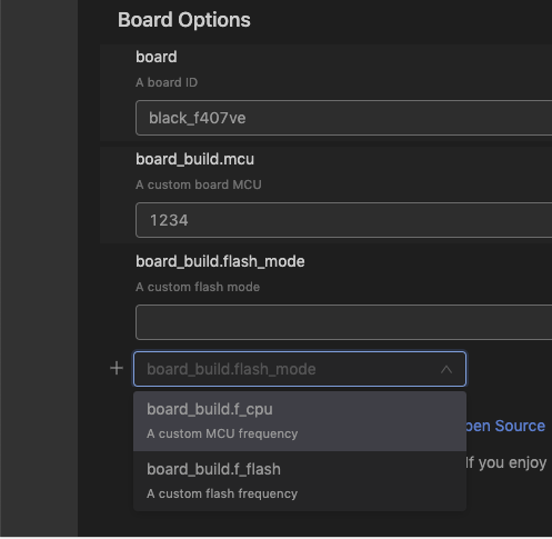
In the screenshots above, the combo box is too close to an existing option; just look at the distance of the text field to its title vs the distance between the text field and the combo box. It needs to be set apart further.
So given it takes a lot of vertical space, it should probably only appear once or twice on the page and not in each group. Otherwise, the clarity of the page will suffer again. So it would need to be put at the top (between section name and the first group) and/or at the bottom of the page.
An alternative would be to use a minimalistic element such as a plus button. The combo box only appears if the button is clicked. I’m not sure if such a UI element exists and is intuitive. But it would allow to put the button in each group.
I think Ivan has only shown the latter option - below. Which is probably where if this model were to be used it should go… so making it a more natural ‘add’ than ‘insert’. Then again, having said that, if it were right under the heading, perhaps the difference in size no longer matters, and it’s easy to find as it’ll always be right under the heading. 
Given for an [env] block there can be up to 10 sections/categories of options - you have a point about usage of space. At the same time, I don’t like the idea hiding stuff behind a unlabelled button… it’s ok once you know it’s there… and also adds another click. A button suitably sized for clicking on could be the same side as the textbox, making it pointless if saving space was the goal. Unless… what about adding a ‘+’ / ‘+ Add Option’ button at the end of the heading, which would insert the list box under the heading (or replace the + button if it can be vertically sized the same)?
How does this cope with sections that haven’t been added yet? i.e. I don’t have any test options or debug options in a project, so does that mean there will be a heading for that just so the add combo can exist? Is that going to be a problem?
We have just deployed 3.1.0-beta.2. Could you re-run pio upgrade --dev and restart PIO Home/DE?
We totally changed UI, it’s now based on adding options manually.
Do you have any proposals for button names? Are they clear now?
Thanks!
1 Like
Just updated, and have to say it’s really starting to look nice! Some thoughts based on latest changes…
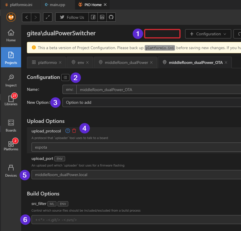
For the ‘table of contents’ icon (at 2), maybe it would be better up the top (at 1) as a labeled button, especially since the toggled state is preserved across tabs? It seems like it is more appropriate out of the way at the top anyway.
The add option (at 3) looks good, and does seem the appropriate place to put it. Nice!
I like the fact the help and delete icons hide until you move over (at 4), and the colour change for the delete icon was a nice touch.
I can see from 5 and 6 that there is some difference in shading to indicate that 6 is still the default, and hasn’t been set. But I don’t think the change in shading is enough at 6… I’d really have to look at it for a moment to realise it’s still at the default values. In doing so, another potential issue sprung to light… in adding the src_filter option, but setting anything, an empty src_filter was set… perhaps multi-line/string options should be ‘ignored’ / not written to file if no value set?
Finally, a question… is seeing all of the configuration options, set or unset, going to be an option again? Toggle-able, defaulting to only configured options by default? Just wondering?
I like the progress and the Ui for adding options seems is now quite reasonable.
There are a few minor things that could be improved:
- Move the Table of Contents button to the top as proposed by Peter
- Enable copy & paste in the text fields
- Enable ESC to close the “New option” popup to close
- Somehow make the New Option stand out more. It still looks more like a text field that could be fill in and not like the UI element to will modify the structure. Think about removing the label and moving it to the left border; or add more vertical space above it…
It’s now time to address the two other main topics:
- Managing configurations inheriting from other configurations
- Assistance when filling in options
To test it, I tried to add a second board to an existing platformio.ini file and move the common settings to a global configuration. It was quite frustrating:
- I initially picked the wrong configuration type because the three options didn’t make sense to me.
- There was no support in entering the board ID. The help icon directed me to the documentation and from there to the Board Explorer. So I looked the board up in the browser even though there is a board explorer in PIO Home.
- I couldn’t paste the board ID into the field as Paste didn’t work.
- Very surprisingly, to delete a configuration you have to close the tab. It’s surprising because closing an editor tab is a non-destructive operation in any IDE.
- There is no visualization whatsoever that certain values are inherited from other configurations or override them and how these configurations interact.
- There is no complete view of a configuration including the options inherited from the global configuration. I kept switching between tabs but and then went back to the text file…
- When adding the PlatformIO Core configuration, big letters said: No Options defined!. This is like shouting at the user and saying you made a mistake…
Regarding the + Configuration drop down, I propose the following names and order of options:
- Configuration
- Common Configuration
- PlatformIO Settings
1 Like
Could that be the keyboard input bug rearing it’s ugly head? I just tried copying and pasting from one env into another, and it worked. Or am I misunderstanding that? i.e. I created a new env, switched to an old one, copied the platform entry for it (atmelavr) and then pasted it into the new one.
Ouch! Nice way to lose your carefully crafted env if you’re not paying attention… if that behaviour persists, should have a warning prompt at minimum. I’d suggest not allowing closure of tabs, and a nice big red threatening delete button at the very bottom of the options screen… lets keep the delete option far, far away!
Do you think it’s a good idea to move the + Configuration button to the tab row?
i.e. it would start looking something like this… with the ToC button being a proper toggle … show / hide… etc.
While the position of + Configuration button is very intuitive, the hybrid tab / drop-down UI element is not. It would require further changes, e.g. a tab that creates a new configuration immediately but let’s you select the type later…
Hm… I could see that working… it would open a new tab… and have some nice big buttons detailing what configurations you can insert… i.e PlatformIO Core, Global Environment & User Environment with descriptions to tell you exactly what they mean … and then show the correct fields… nice thinking!
Going back to your comment in the inherited options… perhaps that could also be a toggle up the top i.e. Show/Hide Inherited Options, which when shown should show the global/inherited options, and in a different colour? I think that would go partway into what TD-er was asking for, without going into too much depth?
Don’t hate me Eugene! 

Just updated to the latest and the changes in the representation are really an improvement.
I also found a bug in parsing the build flags:
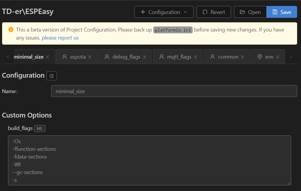
The build flags noted in the platformio.ini file are:
build_flags =
-Os
-ffunction-sections
-fdata-sections
-Wl,--gc-sections
-s
This has to be on the same line: -Wl,–gc-sections
I still cannot save the config, so not sure what will happen when you do save it.
Als the parsing of multiple ini files is not working, so that makes it hard for me to test the env sections.
See here for the ini files I’m using.
1 Like
@manuelbl @pfeerick @TD-er , we have just published the next beta of PIO Home 3.1 with PIO Core 4.1.1b4. Please re-run pio upgrade --dev. Also, please kill all python.exe/platformio.exe processes form a task manager. It seems that the latest VSCode versions do not kill PIO Home server on exit. We will check it.
We fixed everything that you reported above. Also, a lot of UI improvements. The last thing is value hints for known options. See 3.1 Milestone · GitHub
Thanks a lot for amazing help and testing! We are so close to release PIO Core 4.1.1 with PIO Home 3.1 and Project Configuration PREVIEW.
It still doesn’t parse the .ini files mentioned in the extra_configs list.
Saving still doesn’t work, or maybe I don’t use it like it should?
For example if I alter the name of an env and press Save, it should alter the file, right?
The file has not changed.
We don’t support extra scripts. Please file a feature request here Issues · platformio/platformio-home · GitHub
@eugene.liulka please help here.
I tested and saving after rename works. Probably @TD-er tells about extra_configs are not loaded and saved. If it’s not the case I suppose then please provide configuration file that fails to be saved.
Nope, I tested with a very simple platformio.ini file.
I used this one: GitHub - TD-er/MCVE_ESPxx: Repository for quick testing to create a MCVE for bug reports (well known to @ivankravets by now I guess ![]() )
)
1 Like